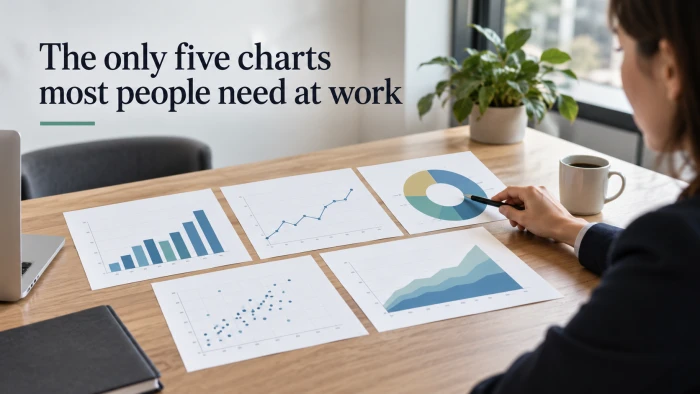
Nearly every question asked at work is one of five: which is bigger, how did it change, what is it made of, do these two things move together, and what is typical. Each has a chart built for it.
Five questions, five charts.
| Chart | The job it does | Reach for it when | A workplace example |
|---|---|---|---|
| Bar chart | Compares amounts across named things | You are ranking or sizing up categories | Revenue by region, tickets by channel |
| Line chart | Shows how a value moves over time | Dates run along the bottom axis | Monthly active users, weekly churn |
| Stacked bar | Shows a total and what it is made of | Parts add up to a whole across groups | Spend by team per quarter |
| Scatter plot | Reveals whether two measures move together | Each row has two numbers | Ad spend against leads, deal size against days to close |
| Histogram | Shows how values are spread out | You want the typical case and the tail | Time to resolve a ticket, order value |

That is the whole set. The rest of this guide shows how to read and build each one, where each shines and where it struggles, and which charts you can stop making altogether.
The one question that picks the chart
You do not need a decision tree. Ask one question, "what do I want the reader to compare?", then follow four short steps.
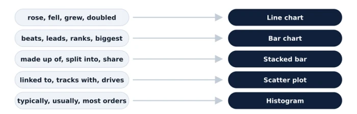
The verb in your claim already names the chart.
01 - Write the claim, not the topic
A topic is "sales". A claim is "sales rose 20 percent after the relaunch". The claim has a verb, and the verb is what picks the chart. If you only have a topic, you are not ready to draw yet.
Topic: support tickets. Claim: email brings in more tickets than every other channel combined.
02 - Spot the verb and match it
Rose, fell, and grew mean change over time, so a line. Beats, leads, and ranks mean comparison, so a bar. Made up of and split into mean composition, so a stacked bar. Linked to and tracks with mean a relationship, so a scatter. Typically and usually mean a distribution, so a histogram.
"Brings in more than" is a ranking verb. That claim wants a bar chart.
03 - Count what will be on the page
One measure across a few categories fits a bar. One measure across dates fits a line. Two measures per row fit a scatter. Many rows of one measure fit a histogram. A total split into parts fits a stacked bar. If your count does not match the verb, trust the count and rewrite the claim.
Five channels, one number each. That is a bar chart with five bars, no more.
04 - Sort, label, and cut one thing
Sort bars by value. Label the last point on a line. Put the segment you care about at the base of a stack. Then delete one element you can live without, such as a legend, a gridline, or a decimal place. What remains is the chart.
Email at the top, social at the bottom, values written on the bars, legend removed.
If a claim does not fit any of the five verbs, the Financial Times Visual Vocabulary groups every chart by the story it tells and will point you to the rare exception.
The bar chart
For ranking and comparing named things
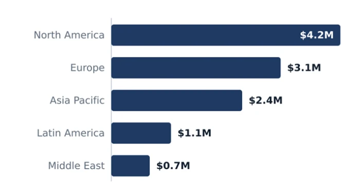
Revenue by region, sorted, axis at zero, values on the bars.
Which region sold the most? Which channel brings the most leads? Who is furthest behind on tickets? Every one of those is a bar chart. The eye judges length precisely, so bars settle "which is bigger" arguments faster than any other picture.
How to read it
Each bar's length is its value, measured from a shared baseline. Compare lengths, not colors, and read the order from the top: the first bar is the winner, and the gap between neighbors is the margin.
Variants worth knowing. The column chart turns the bars upright. The grouped bar sets two or three series side by side for each category. The lollipop swaps a thick bar for a thin line and a dot when you have dozens of categories.
Build it in three moves
1 Sort by value, largest first. Alphabetical order forces the reader to hunt. Sorted order hands them the ranking. The only exception is a category with a fixed order of its own, such as age bands or months.
2 Go horizontal when labels are long. Region names, product names, and survey answers read cleanly on the left of a horizontal bar. Vertical columns push those labels into a tilt nobody enjoys reading.
3 Start the axis at zero. Bar length is the entire message. A bar cut off above zero turns a 5 percent gap into a visual landslide, and readers will rightly feel misled.
The usual mistake. Bars in the order the spreadsheet happened to be in. Sorting takes one click and doubles readability.
Swap it when the categories are dates. Time on the bottom axis wants a line, not a row of columns.
Advantages Precise comparison. Length from a shared baseline is the judgment people make most accurately, so even small differences between categories are visible. Scales to many categories. Twenty sorted bars still read cleanly. Twenty pie slices or twenty lines do not. Labels stay readable. Horizontal bars give long names room on the left, and values can sit directly on the bars, so no gridlines or legend are needed. Familiar to everyone. No reader needs training. It works equally well in a board deck, a team chat, and a printed report. | Disadvantages Weak at showing change. A row of columns for twelve months reads as twelve separate items rather than a path, so trends and turning points are harder to see than on a line. Sensitive to axis tricks. A baseline that starts above zero exaggerates gaps, and readers who spot it stop trusting the rest of the report. Eats vertical space. Forty categories means a long scroll. You usually have to group the tail into "Other" or show only the top ten. Says nothing about spread. One bar per category hides the range behind the average, so two teams with the same bar can have very different experiences. |
The line chart
For showing how something changes over time
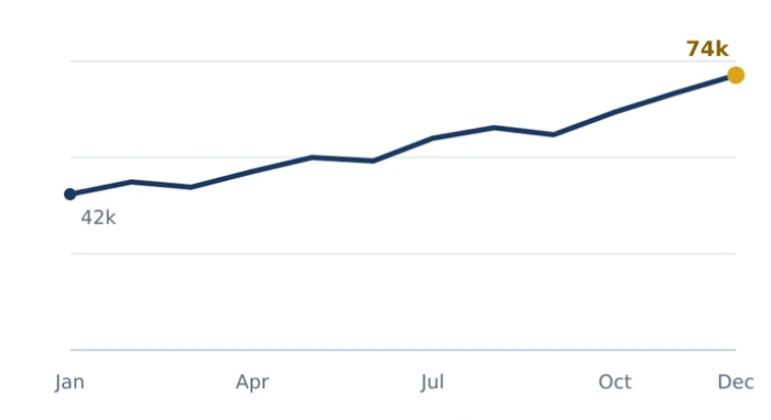
Monthly active users, one line, last value labeled.
Is churn improving? What happened after the price change? Do sign-ups dip every August? The line chart answers all of these by turning time into a path the eye can walk along, left to right, past to present.
How to read it
Time runs left to right. The slope of each segment is the speed of change: steep means fast, flat means steady, and a bend marks the moment something happened. When two lines share the chart, the vertical gap between them is the difference at that date.
Variants worth knowing. The area chart fills beneath the line to stress volume. The sparkline is a tiny line dropped inside a table cell. The step line is for values that jump at fixed moments, such as a price or a headcount.
Build it in three moves
1 Put time on the horizontal axis, evenly spaced. Oldest on the left, newest on the right, with equal gaps between periods. Uneven spacing bends the slope and quietly changes the story.
2 Keep to three or four lines. Beyond that you have a tangle. If there are more series, grey out the ones that are context and color only the one the claim is about.
3 Label the last value on the line. The reader should never have to trace back to the axis to learn where things stand today. Write the final number right at the end of the path.
The usual mistake. Eight lines in eight similar colors, known in the trade as the spaghetti chart. Nobody can follow any single strand.
Swap it when you only have two or three time points. A line between three dots implies a smooth path that never existed, and plain bars are more honest.
Advantages Shows direction and speed at once. A steep segment is fast change and a flat one is stability, and the reader gets both without reading a single number. Handles many points. Twelve months or 365 days fit the same width. Bars would run out of room long before that. Compares a few series cleanly. Two or three lines show who is ahead, by how much, and exactly when they crossed. Makes events visible. One marker for a launch, a price change, or a holiday explains the bend in the line better than a paragraph could. | Disadvantages Misleads with few points. A line through three dots invents a smooth path between them. The reader sees a trend where there are only three measurements. Turns to spaghetti. Past four series the lines overlap, colors blur, and nobody can follow a single strand. Hides the total. Separate lines show each part but never the sum. If the whole matters, a stacked bar or stacked area does that job. Invites false calm on smoothed data. Rolling averages look serene and can hide the day-to-day swings that actually hurt. |
The stacked bar
For showing a total and what it is made of
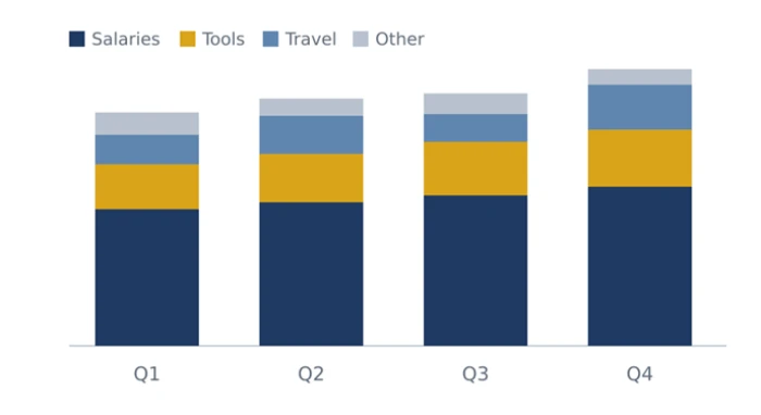
Spend by category, the biggest part sits on the baseline.
How is spend split across teams each quarter? What share of tickets are billing questions? Where does headcount sit by office? A stacked bar answers two things at once: the size of the whole, and the size of each piece inside it.
How to read it
The full height of a bar is the total. Each colored band is one part. Read the bottom band across bars for an accurate comparison, because it sits on the baseline. Read the other bands within a single bar, where they are easy to size, rather than across bars, where they float.
Variants worth knowing. The 100 percent stack makes every bar the same height so only the mix shows. The stacked column turns the bars upright. The diverging stacked bar is the standard way to show survey scales that run from disagree to agree around a center line.
Build it in three moves
1 Put the segment you care about at the base. Only the bottom segment sits on a straight baseline, so only the bottom segment can be compared across bars with any accuracy. Give that position to the part your claim is about.
2 Limit the stack to four or five segments. Roll everything smaller into a single "Other" band. Ten thin slivers in ten colors are unreadable and make the legend longer than the chart.
3 Choose between totals and shares on purpose. When the size of the whole matters, stack raw values. When the mix is the point, stack to 100 percent so every bar is the same height and the shares line up.
The usual mistake. Comparing middle segments across bars. They float at different heights and have no shared baseline, so the eye guesses and guesses wrong.
Swap it when only one part matters. A plain bar chart of that single part is clearer than a stack where the other segments are noise.
Advantages Two answers in one chart. The total and its makeup, in the same space a plain bar would take. Nothing else does that as compactly. Compact for composition over time. Four quarters of category mix fit in one small chart that a row of four pies could never match. The baseline part reads accurately. Whatever you place at the bottom is compared across bars as precisely as a plain bar chart. Shows shifts in mix. A band that thickens or thins from one bar to the next is a visible story about what is growing and what is fading. | Disadvantages Middle segments are hard to compare. They float at different heights across bars, so a difference of a few points is invisible to the eye. Too many segments collapse into slivers. Past five bands the chart becomes stripes, and the legend grows longer than the picture. Totals vanish in 100 percent mode. Equal-height bars hide whether the whole grew or shrank, which is sometimes the more important fact. Color carries all the meaning. Without direct labels or a clear legend, readers lose track of which band is which by the third bar. |
The scatter plot
For revealing whether two measures move together
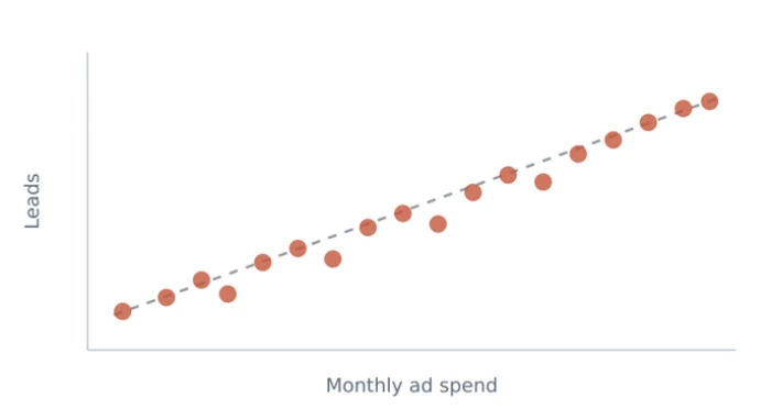
Ad spend against leads, one dot per month, light trend line.
Do bigger deals take longer to close? Does ad spend actually bring leads? Are faster replies linked to happier customers? Any time each row in your data carries two numbers, the scatter plot shows whether they travel together, and it shows the outliers that do not.
How to read it
Every dot is one record placed by two numbers. Look for three things: the drift of the cloud (rising to the right means the two measures climb together), how tight the cloud is (tight means a strong relationship), and any dots sitting far from the rest (the outliers worth a conversation).
Variants worth knowing. The bubble chart sizes each dot by a third measure. The connected scatter joins dots in time order to show a path. Small multiples repeat the scatter once per group so you can compare relationships side by side.
Build it in three moves
1 Put the cause, or the thing you control, on the horizontal axis. Spend, price, hours, headcount go left to right. The outcome you hope moves with it goes up the side. Readers instinctively read "as this goes right, that goes up".
2 Use one dot per record with a little transparency. Semi-transparent dots let overlaps darken, so dense clusters show as dense. Solid dots hide how many points are hiding under one another.
3 Add a trend line only if it helps, and say what it is not. A light dashed line makes the direction obvious. Then write plainly that a pattern is not proof of cause, because your reader will assume it is.
The usual mistake. Reading correlation as cause. Ice cream sales track with sunburn, and neither one causes the other.
Swap it when you have fewer than ten records. At that size a small table is more honest than a cloud of dots that only looks like a pattern.
Advantages Shows the relationship, not just a summary of it. A correlation figure says 0.7. The scatter shows the shape behind that number, including whether it is one clean slope or two separate clusters. Reveals outliers instantly. One deal that took 200 days sits alone on the right edge and is impossible to miss. Handles thousands of points. With a little transparency, density becomes visible where dots pile up, and the chart stays readable. Starts the right questions. Clusters and gaps prompt "why is that group up there", which is exactly where useful analysis begins. | Disadvantages Easily misread as cause. Two things moving together does not mean one drives the other, but nearly every reader will assume it does. Overplotting hides the story. Solid dots stacked on top of each other look like far fewer points than there are, and the densest region can look empty. Needs numbers on both axes. A category on either axis breaks the chart. Region names or product types belong on a bar chart instead. Less familiar to some readers. A room used to bars and lines may need one sentence of explanation before the picture makes sense. |
The histogram
For showing how values are spread out
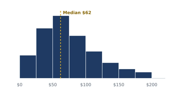
Order value, bars touching, median marked as an anchor.
How long do tickets usually take? What does a typical order look like? Are salaries clustered or spread wide? An average hides all of that. A histogram shows where the pile sits, how wide it is, and whether a long tail is dragging the average away from the typical case.
How to read it
The bottom axis is one measure cut into ranges. Bar height is how many records fall in each range. The tallest bar is the typical case, the width of the pile is how much values vary, and a thin stretch of short bars off to one side is a tail: rare but large values that drag the average away from the middle.
Variants worth knowing. The density curve is a smoothed histogram. The box plot compresses the same information into a five-number summary and is better for comparing many groups. The dot plot works when you have too few values for bars.
Build it in three moves
1 Choose round, sayable bins. Zero to 2 hours, 2 to 4, 4 to 6. Bins that a colleague can repeat out loud are bins they can reason about. Odd widths like 0 to 3.7 make everyone stop and recalculate.
2 Keep the bars touching. The bottom axis is a continuous scale, not a set of categories, and touching bars say so. This single detail is what separates a histogram from a bar chart.
3 Mark the median with a thin line. It gives the reader an anchor for "typical". If the average sits somewhere else, mark that too, because the gap between them is often the whole story.
The usual mistake. Reporting only the average of a lopsided distribution. "Average resolution time is 11 hours" can be true while most tickets close in 4.
Swap it when you need to compare the spread across many groups at once. A row of box plots, one per group, is easier to scan than a row of histograms. The Data to Viz histogram page walks through bin choices in more depth.
Advantages Shows the typical case and the exceptions together. The peak is "usually", the tail is "sometimes", and a good decision needs both. Exposes lopsided data. A long right tail explains why the average is higher than most people's actual experience, which no single number can do. Finds hidden groups. Two peaks mean two populations mixed together, such as two customer types or two product tiers, that deserve separate treatment. Sets realistic targets. A goal like "resolve 80 percent within 8 hours" can be read straight off the chart instead of guessed. | Disadvantages Bin choice changes the shape. Wide bins smooth away detail and narrow bins add noise. There is no single right answer, so you have to try a few and say which you chose. Confused with bar charts. Readers may treat the ranges as categories unless the bars touch and the axis is clearly a scale. Hard to compare many groups. Overlaid histograms turn to mud. Box plots or a grid of small histograms do that job better. Needs enough data. Fewer than about thirty values produce a ragged shape that suggests patterns that are not really there. |
Charts you can retire
Most other charts are either a weaker version of one of the five or a special case you will rarely meet. Here is what to stop making, why, and what to use instead.
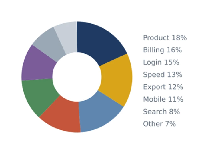 Eight slices, most of them nearly the same size. The ranking is invisible. | 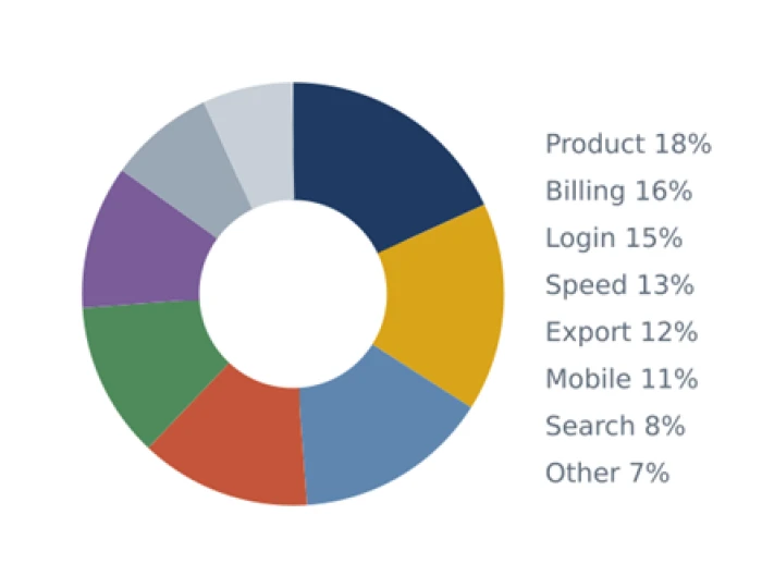 The same eight numbers as sorted bars. The order reads in one pass. |
Pie chart, replaced by the bar chart
| Point of difference | Pie chart | Bar chart |
|---|---|---|
| What the eye judges | Angle and area, which people estimate poorly | Length, which people estimate well |
| Close values | Slices within a few points look identical | Small gaps stay visible |
| Number of categories | Falls apart past three or four slices | Comfortable with a dozen or more |
| Ranking | No natural order around the circle | Sorts cleanly, top to bottom |
| Labels | Need a legend or leader lines | Sit right beside each bar |
| Space used | A large circle for little information | Compact, fits in a column |
| Keep it only for | One dominant share against everything else | Almost every other comparison |
Gauge, replaced by a bar with a target line
| Point of difference | Gauge or speedometer | Bar with a target |
|---|---|---|
| Information shown | One number and a needle | The number, the target, and how far apart they are |
| Precision | Reading a needle angle is rough | Reading a bar against a line is exact |
| Context | No history, no comparison | Easy to add last period or other teams beside it |
| Several at once | Six gauges become a wall of dials | Six thin bars stack in a small space |
| Space used | A large arc for a single value | One row of a table |
Radar chart, replaced by a bar chart
| Point of difference | Radar or spider chart | Bar chart |
|---|---|---|
| Axis order | Arbitrary, and it changes the shape | Sorted, and the order carries meaning |
| Reading values | Judging distance from a center point | Judging length from a shared baseline |
| Area distortion | Filled shape exaggerates big values | No area effect, only length |
| Comparing items | Overlapping polygons hide each other | Grouped bars sit side by side |
| Keep it only for | A quick personality-style profile with few axes | Any real comparison of scores |
Dual-axis chart, replaced by two small charts
| Point of difference | Dual-axis chart | Two charts, one above the other |
|---|---|---|
| Honesty of the scales | Either axis can be stretched to suggest any relationship | Each chart has one honest scale |
| Where lines cross | Crossings look meaningful but are an artifact of scaling | No false crossings |
| Reading effort | Reader must match each line to the right axis | Each chart reads alone |
| Showing a relationship | Implied, never proven | Use a scatter if the relationship is the claim |
| Space used | Slightly less | Slightly more, and worth it |
Build them in the tools you already have
All five charts exist in every mainstream tool. The differences are in defaults, polish, and how much cleanup you have to do afterwards.
Excel or Google Sheets - Fastest start
The spreadsheet you already have open. Select the cells, insert a chart, and all five types are in the first menu. It is the right choice for a number you need to check today and a chart you will share once.
Watch for the defaults. Sheets and Excel add gridlines, legends, and bright colors you will want to strip, and neither sorts bars for you.
Datawrapper - Publication ready
A web tool that turns a pasted table into a clean, responsive chart with no code. Its defaults are already sorted, labeled, and colorblind-safe, so a bar or line chart looks finished the moment it renders. Widely used in newsrooms for that reason.
Watch for its scope. It is built for single charts to publish, not for live dashboards. The Datawrapper Academy has a short guide for each of the five types.
Looker Studio - Free dashboards
Google's free dashboard builder. Connect a sheet or a database, drag the five chart types onto a page, and share a link that refreshes on its own. Good for a team page people check every Monday.
Watch for the urge to fill the page. A dashboard with twelve charts is twelve chances to be ignored. Three charts that answer three claims is better.
Power BI or Tableau - Heavy dashboards
The full business intelligence platforms. They connect to warehouses, handle millions of rows, and let readers filter and drill into a chart. Worth it when many people will explore the same data every week.
Watch for the setup cost and the temptation to use every visual in the gallery. Stick to the five and the dashboard will be easier to read and maintain.
Python or R - Repeatable analysis
For analysts who make the same chart every week. A few lines of matplotlib, seaborn, or ggplot2 produce the chart from the raw data, so next week is a rerun rather than a rebuild. Histograms and scatter plots are especially painless here.
Watch for raw defaults. Code libraries give you a correct chart, not a pretty one, so budget a few lines for labels, sorting, and color.
Slides or a document - The final mile
Wherever the chart ends up. Paste it at a readable size, write the claim as the title, and put the source in small text underneath. Most charts fail here, not in the tool that drew them.
Watch for shrinking. A chart pasted at half size loses its labels first. If it does not read from the back of the room, it does not read.
The bottom line
Five charts cover almost every question you will be asked at work. Bar for comparing, line for change, stacked bar for composition, scatter for relationships, histogram for what is typical.
You do not choose between them by taste. You write the claim, the verb picks the chart, and then you sort, label, and cut one thing. That routine takes less time than scrolling a chart menu.
Everything else, pies, gauges, radars, and dual axes included, is either a weaker version of one of the five or a rare special case. When one of those turns up, reach for the bar chart first and see if it does the job. It usually does.