
The one-sentence trick
The fastest way to pick a chart is to stop thinking about charts. Describe your data in one plain sentence first.
Try it now. Finish this line about your numbers: "I want the reader to see that ___." The verb you reach for does most of the work. "Rose", "fell", and "grew" point to time. "Beats" and "leads" point to comparison. "Makes up" points to parts of a whole.
That sentence pulls double duty. It becomes the title of your chart, and it names the kind of chart you need before you have opened any software.
This is worth the ten seconds because the wrong chart quietly costs you. A reader forced to compare pie slices, or to dig for a trend inside a wall of numbers, drifts away from your point. The right chart delivers it before they finish the title.
So the rest of this guide is really one idea stretched into a checklist: say the sentence, then let it choose the chart.
The 30-second framework
Run these five steps in order. Each one narrows the field, so by the last step you are usually left with a single obvious answer.
1. Say the one sentence out loud
Before you touch a chart, finish this line: "I want the reader to see that ___." That sentence is your title and your compass. If you cannot finish it, no chart will save you.
Example. "I want the reader to see that sales climbed every quarter this year." The verb "climbed" already hints at a trend chart.
2. Name the data relationship
Almost every message is one of five relationships: comparison, trend over time, part to whole, distribution, or relationship between two measures. Naming it points straight at a chart family.
Example. "Climbed every quarter" is a trend over time, which points to a line chart before anything else.
3. Count the variables and categories
Ask how many things you are plotting. One measure across a few categories is simple. Two measures at once, or twenty categories, changes the answer. More categories usually means bars, not slices.
Example. Revenue for 4 quarters is small and tidy, so a single line works. Revenue for 40 products would push you toward a sorted bar chart instead.
4. Check whether time is involved
Time is a special case. If one of your axes is a date or a sequence of periods, a line or an area chart almost always beats bars, because the eye reads left to right as moving forward.
Example. Months on the bottom axis means a line. Product names on the bottom axis means bars, since there is no natural order to walk through.
5. Pick, then take one thing away
Choose the simplest chart that carries the sentence from step 1. Then remove one thing: a gridline, a legend you do not need, a third color, a decimal. Clarity is what you have left after subtracting.
Example. A clean line with the final value labeled beats the same line buried under gridlines, drop shadows, and a rainbow of series.
Match the message to the chart
Step 2 is the heart of the framework, so here is the full lookup. Find your relationship in the left column and start from the chart on the right.
| You want to show | Relationship | Start with | A quick tell |
|---|---|---|---|
| Which is bigger | Comparison | Bar or column chart | Ranking a handful of named items |
| How it changed over time | Trend | Line or area chart | A date sits on the bottom axis |
| What the parts add up to | Part to whole | Stacked bar, or a bar of shares | Values are percentages of one total |
| How values spread out | Distribution | Histogram or box plot | You care about range, not single points |
| Whether two things move together | Relationship | Scatter plot | Two numeric measures per record |
Want a deeper decision tree that branches on your exact data shape? The free reference at Data to Viz maps almost every case, and the Financial Times Visual Vocabulary groups charts by the story they tell.
The core chart types
You can cover most real work with eight charts. Here is what each one does, when to reach for it, and when to leave it alone.
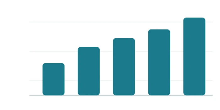
Column chart
Vertical bars that compare a value across a few named categories.
Best for ranking 3 to 12 items. Avoid when labels are long, where horizontal bars read easier.
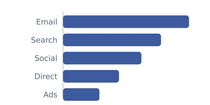
Bar chart
The same comparison laid on its side, which gives long labels room to breathe.
Best for ranked lists and survey answers, sorted by value so the eye reads top to bottom. Avoid when the categories have a natural time order, where a line fits better.
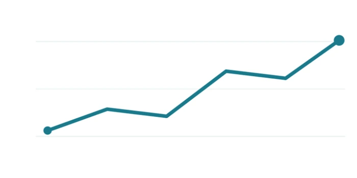
Line chart
Points joined across time so the eye follows the direction of travel.
Best for trends, seasonality, and change. Avoid when the x axis is categories with no order.
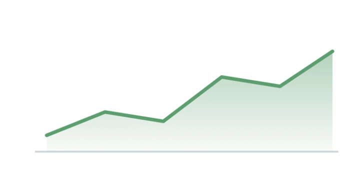
Area chart
A line with the space beneath it filled, to stress volume or a running total.
Best for one series where magnitude matters. Avoid when stacking many, since lower bands get hard to read.
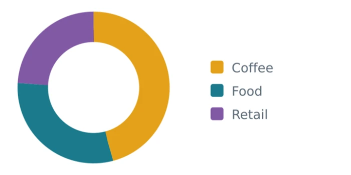
Pie or donut
Slices of a single whole, best kept to a very small number of parts.
Best for 2 or 3 shares that add to 100. Avoid when parts are close in size or there are many of them.
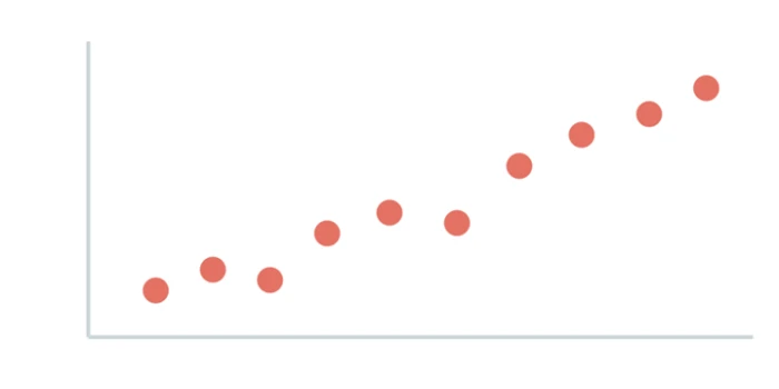
Scatter plot
Every record is a dot placed by two measures, so patterns and outliers pop out.
Best for correlation and clusters. Avoid when you only have a few points, where a table is clearer.
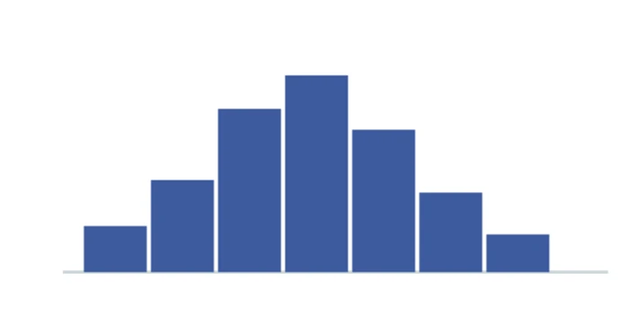
Histogram
Bars with no gaps that count how many values fall into each range.
Best for the shape of a distribution. Avoid when you mean a plain category comparison, which is a bar chart instead.
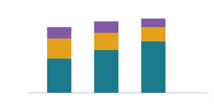
Stacked bar
Bars split into segments so you read the total and the parts at once.
Best for composition across a few groups. Avoid when you need to compare the middle segments precisely.
Bar vs line vs pie, and more
The hardest choices are between charts that look similar. These head-to-head tables give you more than one reason to prefer one over the other.
Bar chart vs pie chart
| Point of difference | Bar chart | Pie chart |
|---|---|---|
| What the eye compares | Bar length, which people judge accurately | Slice angle and area, which people judge poorly |
| Number of categories | Comfortable with many | Breaks down past 3 or 4 slices |
| Close values | Small gaps stay visible | Near-equal slices look identical |
| Ranking | Sorts cleanly from high to low | No natural order around the circle |
| Best fit | Comparing amounts | One dominant share out of a whole |
Line chart vs area chart
| Point of difference | Line chart | Area chart |
|---|---|---|
| Main message | Direction and rate of change | Accumulated volume over time |
| Multiple series | Compares several lines cleanly | Gets muddy once bands overlap |
| Zero baseline | Optional, since only the slope matters | Required, since the fill implies total |
| Emotional weight | Calm and neutral | Heavier, stresses size |
| Best fit | Tracking many trends at once | One total that grows or shrinks |
Grouped bar vs stacked bar
| Point of difference | Grouped bar | Stacked bar |
|---|---|---|
| Compares parts | Easy, bars sit on a shared baseline | Hard, only the bottom segment aligns |
| Shows the total | Not shown directly | Shown as the full bar height |
| Category count | Gets crowded quickly | Stays compact |
| Best fit | Comparing subgroups against each other | Showing a total and its makeup together |
Case study: a coffee shop’s month
Meet Bean and Bar, a small cafe. The owner has three questions and a spreadsheet. Watch the framework turn each question into a chart.
Question 1 of 3
Are sales growing through the year?
The one sentence is "sales rose across the year". That is a trend, and the x axis is months, so step 4 settles it: a line chart.
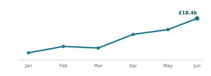
Right choice: the rising line reads at a glance, and the last point is labeled.
The answer. Yes, and steadily. Revenue climbed from about £11k in January to £18.4k in June, a rise of roughly two thirds, with the sharpest jump between March and April. Because the line moves left to right, both the growth and its timing land in a single glance.
Question 2 of 3
Which products earn the most?
The sentence is "coffee earns the most, retail the least". That is a comparison of named items with no time axis, so bars beat everything. A pie would hide the ranking. Here is the same data both ways.
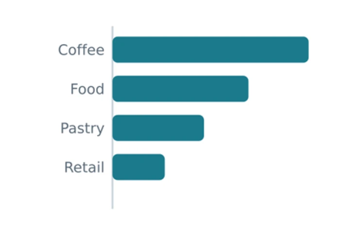 Right choice: ranked, precise, easy to read. | 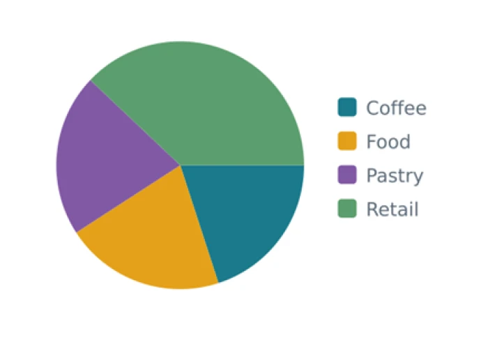 Wrong choice: the order is unclear and slices compete. |
The answer. Coffee earns the most by a clear margin, then food, then pastry, with retail a distant last. On the sorted bar that ranking reads straight down the list. On the pie the same order takes real effort to work out, which is exactly why bars win the comparison.
Question 3 of 3
Do iced drinks sell more on hot days?
The sentence is "iced-drink sales rise with temperature". That is a relationship between two measures, one per day, which is exactly what a scatter plot is for.
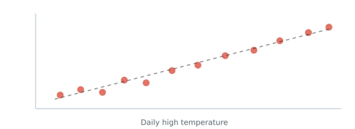
Right choice: the upward drift and the dashed trend line tell the story.
The answer. Yes. As the daily high temperature rises, iced-drink sales rise with it, shown by the dots drifting up to the right and the dashed trend line running through them. On hot days it pays to prep extra iced stock before the queue forms.
The takeaway. Three questions, three relationships, three charts. The owner never argued about chart style. The sentence chose the chart every time.
Tools that build charts fast
Once you know the chart you want, the tool matters less than people think. Here is a short, honest map from need to tool.
Google Sheets or Excel · Fastest start
The spreadsheet you already have. Highlight the cells, insert a chart, and you have a working draft in seconds. Perfect for internal checks and quick answers.
Watch for weak defaults. The out-of-the-box styling is busy, so clean the gridlines and labels before sharing.
Datawrapper · Publication ready
A web tool built for clear, responsive charts with no code. Paste a table, pick a type, and it handles good color, spacing, and mobile sizing for you. Widely used in newsrooms.
Watch for its focus on presentation charts, not heavy dashboards or live database links.
Flourish · Interactive stories
A no-code studio for animated and interactive charts, including scrolling stories and racing bar charts. Great when a chart needs to move or respond to clicks on a web page.
Watch for the temptation to animate everything. Motion should reveal, not distract.
Tableau or Power BI · Live dashboards
Business intelligence platforms that connect to databases and refresh on their own. Built for exploring large data and for dashboards many people revisit.
Watch for the setup cost. They are heavy for a one-off chart, so save them for recurring reporting.
Vega-Lite or Observable Plot · Code and control
Concise chart libraries where you describe the chart in a few lines of a specification or JavaScript. Reproducible, precise, and easy to version alongside your data pipeline.
Watch for the learning curve. You trade a click for a line of code, which pays off only when you repeat the work.
Mistakes that ruin a good chart
You can pick the right type and still lose the reader. These are the errors that show up most often, with the quick fix for each.
| The mistake | Why it misleads | The fix |
|---|---|---|
| Truncated bar axis | Cutting the baseline above zero exaggerates tiny gaps | Start bar axes at zero, always |
| Too many pie slices | Small angles blur together and lose their order | Switch to a sorted bar chart |
| 3D effects | Perspective distorts the very lengths you are comparing | Keep every chart flat |
| Dual y axes | Two scales let you imply any correlation you like | Split into two charts, or index both to a base |
| Rainbow of colors | Color with no meaning adds noise, not signal | Use one color, and a second only to highlight |
| Unsorted categories | Random order hides the ranking the reader wants | Sort bars by value unless order is fixed |
The 30-second cheat sheet
Keep this near your keyboard. Read your goal on the left and start from the chart on the right.
| If your goal is to show | Start here | Second choice |
|---|---|---|
| Which item is biggest | Sorted bar chart | Column chart |
| Change over time | Line chart | Area chart |
| Parts of a whole | Stacked bar chart | Donut for 2 to 3 parts |
| How values are spread | Histogram | Box plot |
| Two measures together | Scatter plot | Bubble chart |
| A single key number | A big number with a label | A small trend line beside it |
The bottom line
Picking a chart is a 30-second decision, not a design debate.
Say the one sentence about your data. Name the relationship it describes, count your variables, check whether time is involved, then choose the simplest chart that carries the sentence and take one thing away.
Follow that and the answers fall out on their own. You reach for a line when something changes over time, a sorted bar when you are ranking, a scatter when two measures might move together, and a stacked bar when parts build a whole. The coffee shop owner never argued about style, because the question chose the chart every time.