Some people go quiet the moment a graph appears. Here is how to land your point anyway, by treating the chart as backup instead of the main event.
You built a clean chart. You are proud of it. Then you share it, and the person across the table checks their phone or asks, "So what am I looking at?"
It stings, but it is useful feedback. Most chart haters do not hate numbers. They hate effort with no obvious payoff.
The fix is rarely a prettier chart. It is a change in how you deliver it. Lead with the point, then let the chart prove you right.
Why smart people tune out

Before you fix the delivery, it helps to know what you are up against. A few things quietly push people away from a graph.
1 They want the answer, not the evidence
You did the analysis so they would not have to. Handing them raw evidence asks them to redo your work.
2 Reading a chart is work
Axes, legends and colors all add to the reader's cognitive load. If the payoff is not clear in about two seconds, focus drifts.
3 A bad chart burned them before
Cluttered slides and vanity metrics train people to expect noise. They brace for confusion out of habit.
4 It feels disconnected from their decision
They came in thinking about a choice. If your point is not tied to that choice, it reads as trivia.
The one shift that changes everything
Stop presenting the chart. Start presenting the takeaway. The chart is your proof, not your opening line.
Practitioners of storytelling with data put it simply: the message leads, and the visual follows.
Say the headline out loud before anyone reads an axis. Something like, "Revenue is up, and a single product is driving all of it." Now the chart has one job: to show that.
A chart is a sentence with a picture attached. If the sentence is unclear, no amount of color will save it.
The same numbers can be framed as a wall to climb or as an answer to accept. Watch what a small change in framing does.
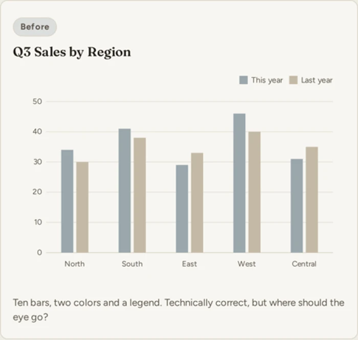
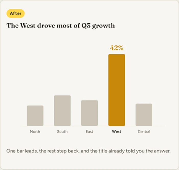
Same data, two framings. The version on the right makes its point before you read a single number.
A method you can reuse
Here is a repeatable way to prep any chart for a skeptical audience. Work through it in order.
1 Write the takeaway as a sentence
Before you touch the design, finish this line in plain words: "The one thing you need to know is ___."
Try this: if you cannot fill that blank without jargon, the chart is not ready to present yet.
2 Know who is in the room
Ask what decision they are trying to make, then shape everything around that decision.
A finance lead wants the number. A creative lead wants the story. Same data, different door in.
3 Put the conclusion in the title
Swap "Q3 Sales by Region" for "The West drove most of Q3 growth."
Try this: a title that states the finding does half your job before you say a word.
4 Lead with one number
Open with a single figure they can hold in their head, then reveal the chart behind it.
One clear number anchors attention. The breakdown can wait until they want it.
For example: instead of opening the full funnel, say "We kept 92 of every 100 customers this quarter," then show the funnel that proves it.
5 Cut everything that is not the point
Remove spare series, heavy gridlines, legends you can label directly, and decimals no one needs. Edward Tufte called this kind of clutter chartjunk.
Try this: highlight the one bar or line that matters and mute the rest, so the eye lands in the right place.
6 Tell it as a short story
Use three beats: what was happening, what changed, and why it matters to them.
Words and picture together always beat either one on its own.
For example: "Sign-ups were flat for months. We rewrote the welcome email. They rose 18 percent the next week." Three sentences, one clear arc.
Read together, the six steps move in one direction, from your message down to the visual. You settle the sentence first in steps 1 to 3, then make the picture serve it in steps 4 to 6. Each step strips a little more effort away from the person listening, which is the whole game.
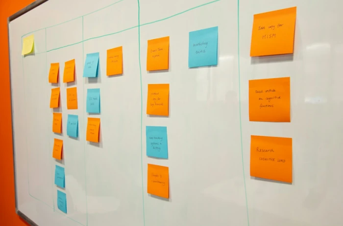
Sort your message into a few beats before you open the file. The chart comes last, not first.
See the method in action
Here is the same six step logic run on one messy dataset, from raw table to a line anyone can accept.
| The raw data | Monthly churn across three plans, twelve rows of percentages. Easy to get lost in. |
| Your sentence | Churn is falling, and the new plan is the reason. |
| One number first | Churn dropped from 6.2 percent to 3.9 percent in a single quarter. |
| The chart title | The new plan cut churn nearly in half. |
| The short story | People kept leaving. We launched the new plan. Now far fewer leave, and the trend is holding. |
| The chart itself | A single falling line, the launch marked with one label. No legend, no second axis. |
Notice the chart is the last thing you build, not the first. By the time it appears, the point is already made.
What to do in the room
Prep gets you halfway. The rest is how you handle the live moment.
• Hand them the takeaway, then pause. Let it land before you add any detail.
• Watch their face, not your slides. A nod means move on. A squint means slow down.
• Offer detail, do not force it. "Happy to go deeper on any of this" invites questions without drowning anyone.
• Treat pushback as a good sign. If they challenge a number, they are engaged. Answer it plainly and keep going.
Lines you can borrow
When nerves hit, having a few sentences ready helps. Steal these.
To open
Here is the one thing worth knowing, then I will show you why.
To offer detail
Happy to go deeper on any part of this whenever you want.
To handle a doubt
Fair question. Here is the number behind it.
To close
So the decision in front of us is this, and here is what the data supports.
Mistakes that lose a chart hater
If your audience keeps checking out, look for these first.
- Opening with your method instead of your message.
- Using six colors when two would carry the meaning.
- Reading the chart out loud, value by value.
- Stacking two y-axes on a single plot.
- Writing a title that names the data instead of the finding.
A 30 second check before you present
- I can state the takeaway in one plain sentence.
- The chart title states the finding, not the topic.
- One number leads, and one element is highlighted.
- I removed at least three things I did not need.
- I know the exact decision this chart supports.
People who hate charts do not need fewer charts. They need charts that respect their time.
The bottom line If your point does not fit in one sentence, the chart is not the real problem. Fix the sentence, keep the picture clean, and let the data earn the second look. The one thing to carry into the room: Message first, chart second. |